The Most Popular Code-based Business Intelligence Tools, Reviewed
Comparing the most popular BI-as-code tools: Evidence, Streamlit, Dash, Observable, Shiny and Quarto
Casey is a data scientist, software engineer and writer. She has previously worked at McKinsey & QuantumBlack, and is currently at Shopify.
There is no single ‘best’ business intelligence (BI) tool; the best tool for you depends on your specific needs, workflow, and skill set.
This guide compares some of the most popular BI-as-code tools to help you find the best fit for your data analytics stack and technical expertise:
- Evidence: A Markdown & SQL app builder for data analysts
- Streamlit: A web app wrapper for Python data scientists
- Dash: A web app framework for Python developers
- Observable: A data visualization toolkit for JavaScript developers
- Shiny: A simple R / Python wrapper for statisticians and researchers
- Quarto: A minimalist Jupyter / Markdown publishing system for academics and technical writers
Each of these tools are open source, and you can find the source code on GitHub.
| Tool | GitHub Repo | License | Languages | Stars |
|---|---|---|---|---|
| Evidence | evidence-dev/evidence | MIT | SQL/Markdown | 4.3k |
| Streamlit | streamlit/streamlit | Apache 2.0 | Python | 35k |
| Dash | plotly/dash | MIT | Python | 21k |
| Observable | observablehq/framework | ISC | JavaScript | 2.5k |
| Shiny | rstudio/shiny | GPL-3.0 | R/Python | 5.4k |
| Quarto | quarto-dev/quarto-cli | MIT | Markdown/Jupyter | 3.9k |
Evidence

A SQL and Markdown tool for creating data apps
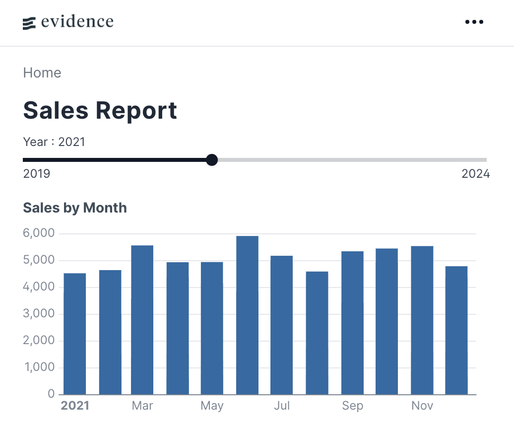
Evidence stands out for its management of data inputs through SQL queries and its creation of page content via Markdown and pre-built components.
Data inputs in Evidence are managed using SQL queries. Page content is created via Markdown and pre-built Evidence components, for common visualizations like tables or bar charts.
Evidence is designed for analysts familiar with SQL and Markdown, offering extensibility through web standards. Evidence apps are polished, performant, and easy for business stakeholders to consume.
Evidence also gives you unlimited ability to define your own custom components using HTML and JavaScript, as well as page styling via CSS. It also supports an ever-growing list of deployment options, including Evidence Cloud - a secure, managed hosting service.
Example Code
# Sales Report

<Slider min=2019 max=2024 name=year_pick title=Year size=full/>

```sql sales_by_month
SELECT
    order_month,
    category,
    sum(sales) AS sales
FROM orders
WHERE year = '${inputs.year_pick}'
GROUP BY ALL
```

<BarChart
  data={sales_by_month}
  title="Sales by Month"
  x=order_month
  y=sales
/>
A good choice if:
- You primarily work with SQL, and you want business-friendly outputs
- You’re not primarily a JavaScript developer
- You want the ability to add custom components if your needs go beyond out-of-box functionality
Not recommended if:
- You don’t want to use SQL queries to manage your data inputs
Streamlit
A web app wrapper around pandas, numpy, and other Python data science staples
If you’re already familiar with things like numpy or pandas, Streamlit’s documentation will make you feel right at home. By wrapping, say, np.histogram in something like st.bar_chart, Streamlit takes care of translating your Python code into a web app.
Streamlit runs your Python script from top to bottom, streaming outputs like text, tables, or charts to the page. This tool can also be used to create a ChatGPT-style chatbot using Python-based outputs.
Example Code
import streamlit as st
import pandas as pd
import numpy as np

st.title('Uber pickups in NYC')

DATE_COLUMN = 'date/time'
DATA_URL = ('https://s3-us-west-2.amazonaws.com/'
         'streamlit-demo-data/uber-raw-data-sep14.csv.gz')

@st.cache_data
def load_data(nrows):
    data = pd.read_csv(DATA_URL, nrows=nrows)
    lowercase = lambda x: str(x).lower()
    data.rename(lowercase, axis='columns', inplace=True)
    data[DATE_COLUMN] = pd.to_datetime(data[DATE_COLUMN])
    return data

# Create a text element and let the reader know the data is loading.
data_load_state = st.text('Loading data...')
# Load 10,000 rows of data into the dataframe.
data = load_data(10000)
# Notify the reader that the data was successfully loaded.
data_load_state.text("Done! (using st.cache_data)")

st.subheader('Raw data')
st.write(data)

st.subheader('Number of pickups by hour')

hist_values = np.histogram(
    data[DATE_COLUMN].dt.hour, bins=24, range=(0,24))[0]

st.bar_chart(hist_values)

hour_to_filter = st.slider('hour', 0, 23, 17)  # min: 0h, max: 23h, default: 17h
filtered_data = data[data[DATE_COLUMN].dt.hour == hour_to_filter]
st.subheader(f'Map of all pickups at {hour_to_filter}:00')
st.map(filtered_data)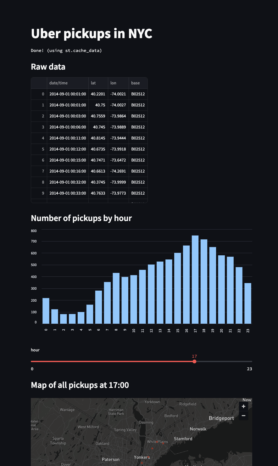
A good choice if:
- You’re a Python data scientist who wants to quickly create a shareable web app
Not recommended if:
- You need to customize UI/UX, beyond basic color themes
- You need fine-grain control over page re-rendering (the entire script re-runs when inputs are changed, unless you manually manage fragments)
- You don’t enjoying writing Python scripts
Dash
A Python-native web app framework that gives direct control over layouts, DOM elements, and callbacks
Dash allows Python developers to create interactive web apps without needing to learn JavaScript. It offers substantial control and customization for those who are willing to dig into documentation. The core of Dash is a Python class that combines a few concepts:
- Python wrappers to render common DOM elements and plotly visualizations (i.e.
html.H1,dcc.Graph); - App layout, defined as a list of the above elements in
app.layout; - Data loading and processing via usual data science tools like
numpyorpandas - Interactivity via callbacks, which accept named inputs from the app (i.e. a value from a dropdown), and return named outputs (i.e. a filtered dataframe)
- The ability to add custom CSS and JavaScript if needed
Dash is built on top of Flask, so any Python developer who has experience using a web framework should feel comfortable in it. While R, Julia, and F# are also listed as compatible languages, the vast majority of Dash’s documentation is written for Python.
Dash is a powerful choice for experienced Python programmers seeking fine-grained control. If you’re not comfortable with mental models like classes, callbacks, or the DOM, however, the learning curve in Dash may seem a bit steep.
Example Code
from dash import Dash, html, dcc, callback, Output, Input
import plotly.express as px
import pandas as pd

df = pd.read_csv('https://raw.githubusercontent.com/plotly/datasets/master/gapminder_unfiltered.csv')

app = Dash()

app.layout = [
    html.H1(children='Title of Dash App', style={'textAlign':'center'}),
    dcc.Dropdown(df.country.unique(), 'Canada', id='dropdown-selection'),
    dcc.Graph(id='graph-content')
]

@callback(
    Output('graph-content', 'figure'),
    Input('dropdown-selection', 'value')
)
def update_graph(value):
    dff = df[df.country==value]
    return px.line(dff, x='year', y='pop')

if __name__ == '__main__':
    app.run(debug=True)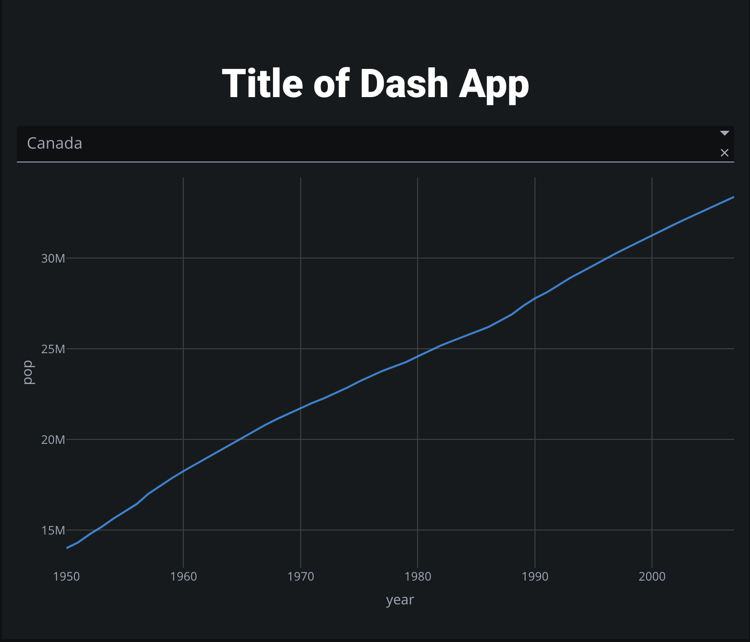
A good choice if:
- You have strong Python skills, and want more direct control over layout, styling, and interactivity than Streamlit
- You already work well in Python-based web frameworks like Flask or Django
- You’re familiar with Python-based data science libraries like pandas, numpy, and plotly
Not recommended if:
- You’re not comfortable with Python classes, callbacks, methods, or decorators
- You’re not comfortable interacting directly with the DOM
Observable Framework
A visualization toolkit for JavaScript-native web developers
If npm run dev is more your speed, Observable Framework is a great choice for bringing the full power of web development to your data visualization. By giving you importable helpers like Plot and FileAttachment, Observable makes it easy to integrate data inputs and pre-baked visualization components into your web app. You still have all of the normal tools of web development at your disposal: HTML, JSX, React components, CSS styles, JavaScript fucntions and imports, etc.
While data loaders for Observable can be written in any programming language, a basic level of comfort with web development concepts (i.e HTML, CSS, and JavaScript) will allow you to make the best use of Observable’s many features.
Example Code
import * as Plot from 'npm:@observablehq/plot';

export function temperaturePlot(data, { width } = {}) {
	return Plot.plot({
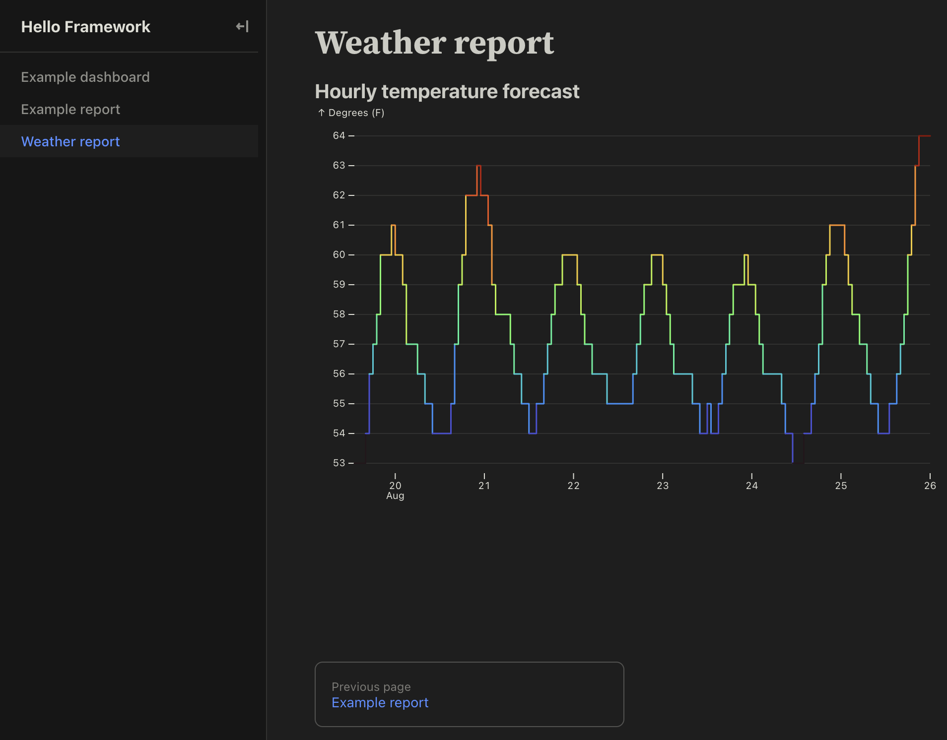
		title: 'Hourly temperature forecast',
		width,
		x: { type: 'utc', ticks: 'day', label: null },
		y: { grid: true, inset: 10, label: 'Degrees (F)' },
		marks: [
			Plot.lineY(data.properties.periods, {
				x: 'startTime',
				y: 'temperature',
				z: null, // varying color, not series
				stroke: 'temperature',
				curve: 'step-after'
			})
		]
	});
}
# Weather report
```js
import { temperaturePlot } from './components/temperaturePlot.js';
```
```js
const forecast = FileAttachment('./data/forecast.json').json();
```
```js
display(temperaturePlot(forecast));
```
A good choice if:
- You’re a web developer who is comfortable in HTML, CSS, and JavaScript, and wants to make full use of your usual tools (i.e. Node, React)
Not recommended if:
- You’re not sure what
nodeandnpmare, or whatasync/awaitmeans
Shiny

An opinionated wrapper around R and Python, with a focus on efficient reactivity
If R or Python is your data science language of choice, and you’re not interested in doing web development proper, or manually managing callbacks, then it may be worth the effort to learn Shiny’s mental models. Of all the tools reviewed in this article, it is probably the most opinionated in terms of creating new Shiny-specific concepts for the user to learn. For example, all user inputs (i.e. dropdowns) are defined via ui.input_*() functions, and all outputs are created by decorators like @render.plot. Even for an experienced Python developer, all of these concepts can take a second to click. Code for a complex Shiny dashboard can get quite cumbersome.
The upshot of all this is that Shiny automatically manages efficient reactivity for you. Their documentation even gives an example of reproducing a Streamlit dashboard for faster performance.
HTML, CSS, and JavaScript can all be managed manually, but the need for these to live inside Python wrappers can make code look a bit clunky.
If you’re happy to use Shiny’s clean, minimal pre-styled components, and prize efficient reactivity, Shiny could be a good choice.
Example Code
from shiny.express import input, render, ui
from shinywidgets import render_plotly

ui.page_opts(title="Penguins dashboard", fillable=True)

with ui.sidebar():
    ui.input_selectize(
        "var", "Select variable",
        ["bill_length_mm", "bill_depth_mm", "flipper_length_mm", "body_mass_g", "year"]
    )
    ui.input_numeric("bins", "Number of bins", 30)

with ui.card(full_screen=True):
    @render_plotly
    def hist():
        import plotly.express as px
        from palmerpenguins import load_penguins
        return px.histogram(load_penguins(), x=input.var(), nbins=input.bins())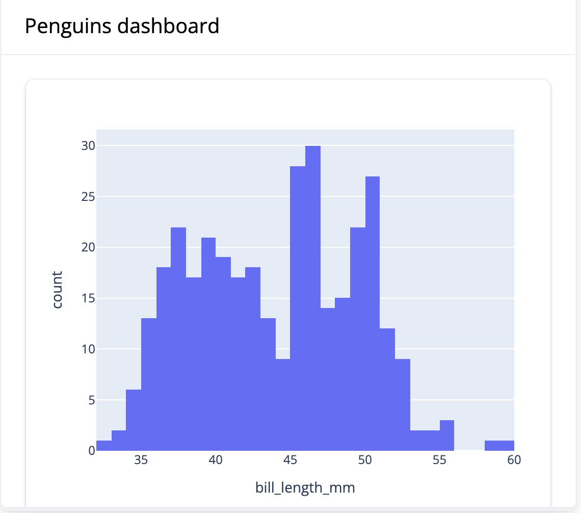
A good choice if:
- You have strong R or Python skills, and you only want to use those languages
- You value fast, efficient reactivity and don’t want to manually manage callbacks
- You’re happy to use clean, minimal, pre-styled components
Not recommended if:
- You don’t want to learn Shiny-specific mental models for managing UI and reactivity
- You’d prefer to directly control UI with a more traditional web dev stack (i.e. HTML / CSS / JS)
- You need highly custom control over look and feel
Quarto

A minimalist Jupyter / Markdown page renderer, aimed at scientific and technical publishing
If your aim is to render data science outputs to HTML files, .doc, or PDF as quickly as possible without any frills, Quarto may be a good choice. Quarto takes Jupyter notebooks or Quarto flavoured Markdown and renders it into a wide variety of formats. Theming is available, as well as some options for interactivity. In fact, if you’re willing to put in the legwork to peruse it, Quarto provides documentation for most things that you may want to do. Overall, however, Quarto is a good choice for those who are already comfortable in Jupyter notebooks, and want to quickly render their work to a shareable format without too much customization or fuss.
If you’re used to publishing your work in LaTeX, Quarto may also appeal as a more modern, flexible alternative which still offers the clean, simple, academic look of a LaTeX document.
Example Code
---
title: 'Quarto Basics'
format:
  html:
    code-fold: true
jupyter: python3
---

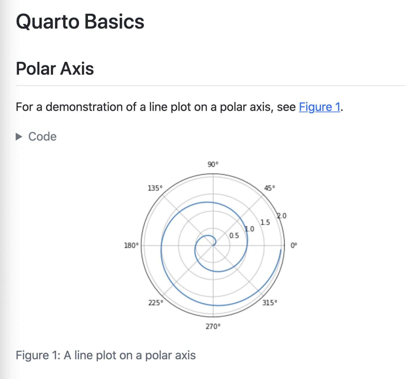
For a demonstration of a line plot on a polar axis, see @fig-polar.

```{python}
#| label: fig-polar
#| fig-cap: "A line plot on a polar axis"

import numpy as np
import matplotlib.pyplot as plt

r = np.arange(0, 2, 0.01)
theta = 2 * np.pi * r
fig, ax = plt.subplots(
  subplot_kw = {'projection': 'polar'}
)
ax.plot(theta, r)
ax.set_rticks([0.5, 1, 1.5, 2])
ax.grid(True)
plt.show()
```
A good choice if:
- You’re already comfortable in Jupyter notebooks or Markdown, and want to quickly render your work to a shareable format with minimal styling
- You don’t mind looking through documentation to accomplish more complex tasks (i.e. custom theming or deployment to a specific service like Netlify)
Not recommended if:
- You need full-fledged web development functionality
- You require extensive control over look and feel, or interactivity
Conclusion
When choosing a BI-as-code tool, consider your team’s technical skills and specific needs:
- Evidence is ideal for analysts who work primarily in SQL and want to quickly create data apps using Markdown
- Streamlit works well for Python data scientists seeking rapid prototyping
- Dash offers more control for Python developers comfortable with web frameworks
- Observable provides full web development capabilities for JavaScript developers
- Shiny suits R/Python users who want efficient reactivity management
- Quarto is perfect for academics and technical writers focused on document publishing
If you’d like to try Evidence for yourself, you can get started for free.
